Design System Overhaul for a Government-Affiliated Product Suite
Redesigned and centralized a scalable, accessible design system using the U.S. Web Design System and Figma variables to eliminate component duplication, streamline workflows, and support consistent product development.
Goal
Centralize and customize a design system using the U.S. Web Design System (USWDS) to improve consistency, scalability, and accessibility across products.They also requested designs for locations that are coming soon and a custom review form to allow customers to leave feedback for the different locations.
Tools Used
Figma (Libraries, Variants, Auto Layout, Variables), U.S. Web Design System
The Challenge
- Components were duplicated across multiple Figma files, often slightly different, with no clear source of truth.
- Designers didn’t know which version was the right one to use.
- Components lacked interactive states, requiring developers to make assumptions.
- The team needed to integrate the U.S. Web Design System (USWDS) but tailor it to the client's branding.
- There was no efficient way to apply updates across projects, slowing down design and development cycles.
Roles & Responsibilities
- Audit all design files to identify redundancies, gaps, and inconsistencies.
- Build a centralized design system in Figma using USWDS as a base, customized to fit the client’s brand and needs.
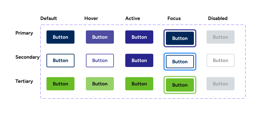
- Design every component with full interactive states (e.g., default, hover, active, error, disabled).
- Use Figma variables to control color, spacing, and type scales for consistency and easy global updates.
- Organize the system for clarity and ease of use for both designers and developers.
- Link each component to its corresponding reference on the USWDS website for developer alignment.

Process
1. Audit & Discovery
- Reviewed multiple design files and found repeated, inconsistent versions of the same components.
- Identified confusion over which components to use and a lack of standardization.
- Evaluated the USWDS system and defined a subset of components relevant to the client's product suite.
- Removed unused or unnecessary components to avoid design system bloat.
2. System Design & Build
- Built a centralized system in Figma, organized into:
-
- Foundations: Color, typography, spacing (using variables)
- Components: Buttons, inputs, alerts, modals, etc.
- Layouts and Templates
- Designed all components to reflect their full interaction states (hover, focus, error, disabled, success).
- Applied Figma variables for theming and scalable styling.
- Connected each Figma component to its official USWDS counterpart via hyperlink for dev reference.
3. Developer Enablement
- Ensured every component was developer-inspectable in Figma with clean structure and specs.
- Used intuitive naming, nested structure, and clear grouping to make navigation seamless.
- Provided light guidance and walkthroughs to design and dev teams during the rollout.
4. Implementation & System Adoption
- Replaced fragmented libraries by linking all product design files to the centralized system.
- Enabled cascading updates, allowing any change made in the design system to reflect across all files automatically.
- Helped teams adopt the new system through onboarding support and ongoing documentation.
Impact
| Before | After |
|---|---|
| Components in multiple places with no clear version control | Single source of truth with one canonical component set |
| No interactive states | Fully designed component behavior |
| Inconsistent specs | Clear, inspectable developer handoff |
| Manual rework for style updates | Global styling updates via Figma variables |
| Brand mismatch with USWDS | USWDS + custom theme alignment |
| Developers lacked references | Each component linked directly to its USWDS spec page |
Why It Mattered
“This project wasn’t just about cleaning up files—it was about creating a system that empowered the team to work faster, more consistently, and with confidence. By building in interactivity, accessibility, and theming flexibility, we gave the design system a strong foundation for growth.”
Key Features
- Built a modular design system with a USWDS foundation
- 100% Figma-native: Variables, Auto Layout, Team Libraries
- Linked every component to its matching USWDS documentation for dev clarity
- Organized for both designers and developers
- Enabled cascading updates across all product design files
- Accessible design patterns (hover/focus/error states)
- Created interactive, accessible components for consistent implementation