Marriott International Associate App and ADA compliance
Conducted a comprehensive accessibility audit, established a robust design system, and redesigned the mobile application to fully address ADA compliance.
Introduction
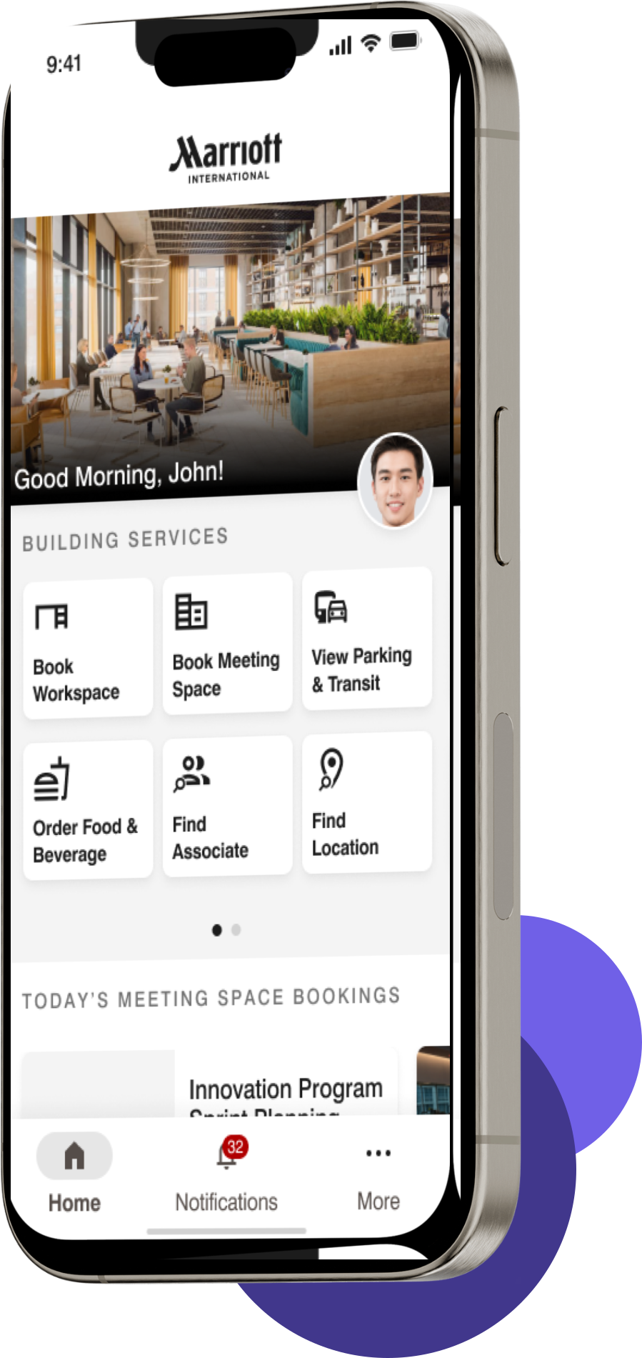
Marriott International’s Property Management App is vital for administrative functions such as scheduling, room bookings, and internal communications. Ensuring the app meets accessibility standards is crucial for inclusivity. This case study evaluates the app’s compliance with Web Content Accessibility Guidelines (WCAG) and the Americans with Disabilities Act (ADA) standards, focusing on the principles of Perceivable, Operable, Understandable, and Robust.
Goal
Identified sections of the mobile app that failed to meet established WCAG and ADA guidelines. Based on these findings, I created a design system and new user flows to address the issues, and redesigned the app to ensure compliance with level AA guidelines.
Evaluation Framework
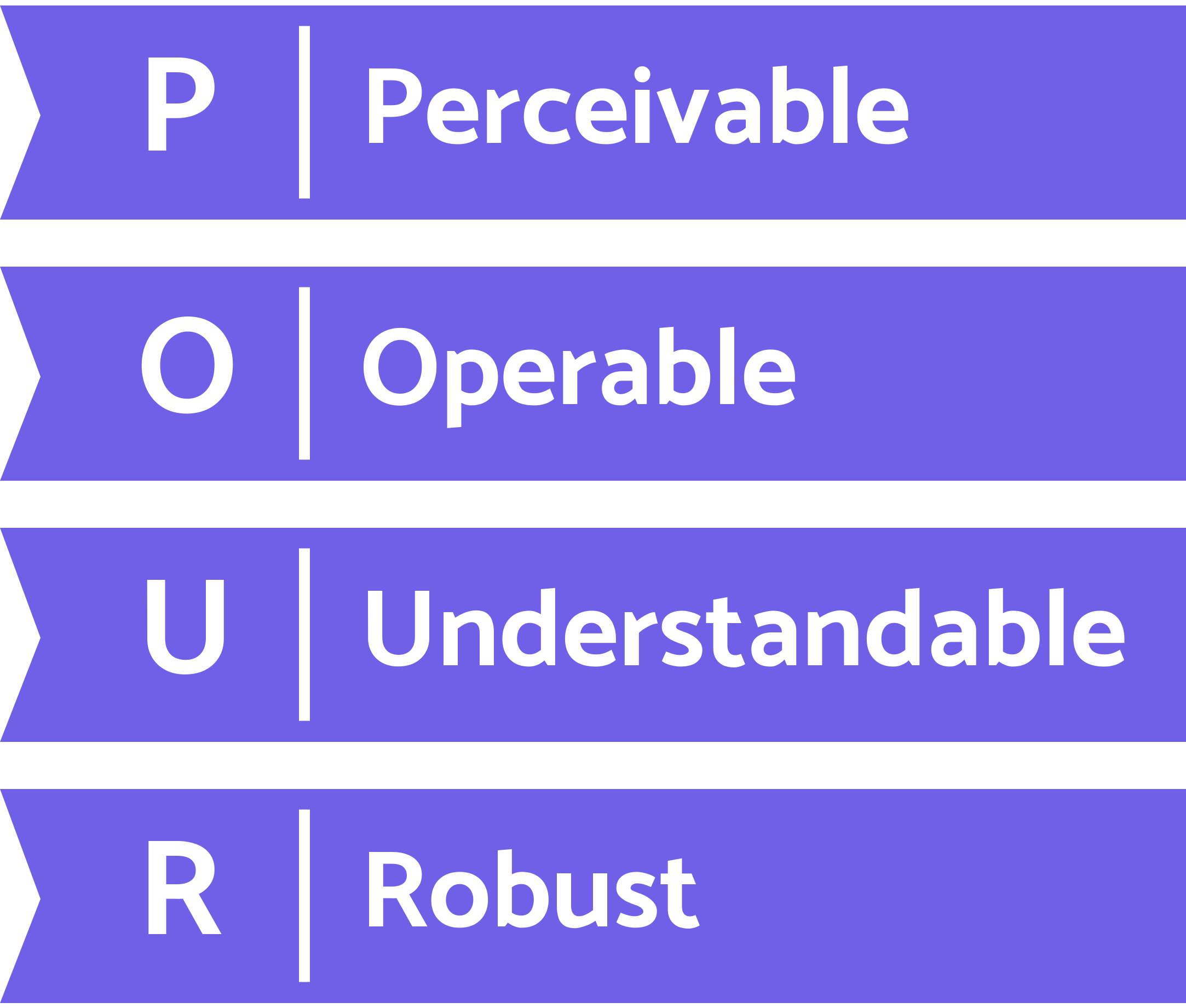
The evaluation adheres to the four key WCAG principles:- Perceivable: Content must be accessible to users in a way that they can perceive and understand.
- Operable: Users must be able to interact with and navigate the interface.
- Understandable: Content should be clear and easy to use.
- Robust: The app must function well across different devices and technologies, including assistive technologies.
Findings & Recommendations
Perceivable
Font and Text Formatting:
- Issue: Inconsistent font sizes with body text often below the recommended minimum of 16px and subtext below 14px.
- Recommendation: Standardized font sizes to ensure body text was 16px and subtext was 14px, improving readability for all users, including those with visual impairments.
Zoom/Magnification and Screen Size:
- Issue: Excessive and redundant information cluttered the view on smaller devices.
- Recommendation: Implement responsive design to display essential information prominently while providing options to view additional details as needed.
Contrast and Color:
- Issue: Some screens, like the parking screen, do not meet the required color contrast ratios, affecting readability.
- Recommendation: Adjust the color scheme to ensure a contrast ratio of at least 4.5:1 for normal text and 3:1 for large text. This will enhance visibility for users with low vision.
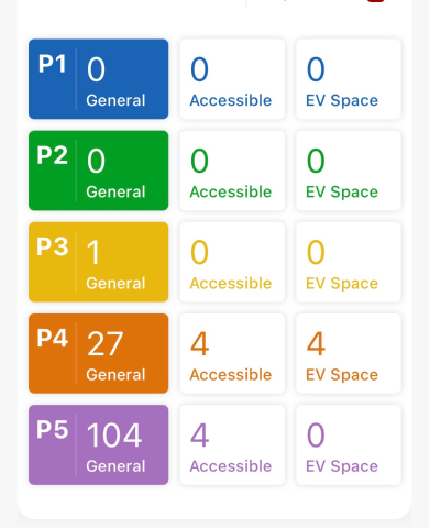
Non-ADA compliant design
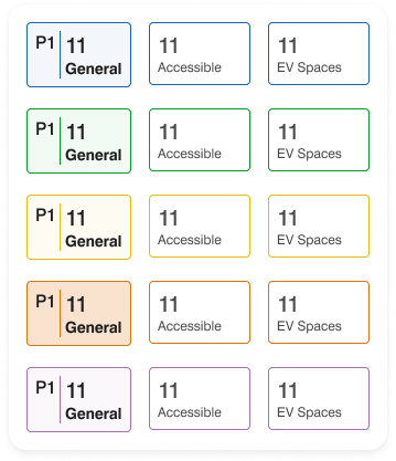
ADA compliant design
Speech Configuration and Form Labels:
- Issue: Labels are often used as placeholders, and some form fields lack descriptive labels for screen readers.
- Recommendation: Use clear and descriptive labels for all form fields, ensuring they are visible and distinct from placeholder text. This will improve screen reader compatibility and usability.
Operable
Touch Targets and Button Placement:
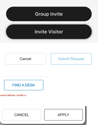
- Issue: Buttons are frequently too small and lack adequate spacing, posing difficulties for users with motor impairments.
- Recommendation: Ensure buttons are at least 44x44 pixels with a minimum of 16px spacing between them. Stacking buttons and ensuring full-width placement will improve accessibility.
Keyboard Navigation:
- Issue: The app does not provide clear focus indicators when navigating with a keyboard.
- Recommendation: Implement visual indicators such as borders or background changes for focused elements. This will assist users relying on keyboard navigation to identify active elements.
Number of Taps:
- Issue: Completing tasks such as locating a workspace or associate requires multiple taps, along with confirming a task has been complete, complicating the process.
- Recommendation: Streamline task completion to reduce the number of taps. For instance, instead of having an overlay communicating task has been completed and having the user tap “close” or "ok", use a toast that dismisses itself after an appropriate amount of time and doesn’t take up the entire screen.
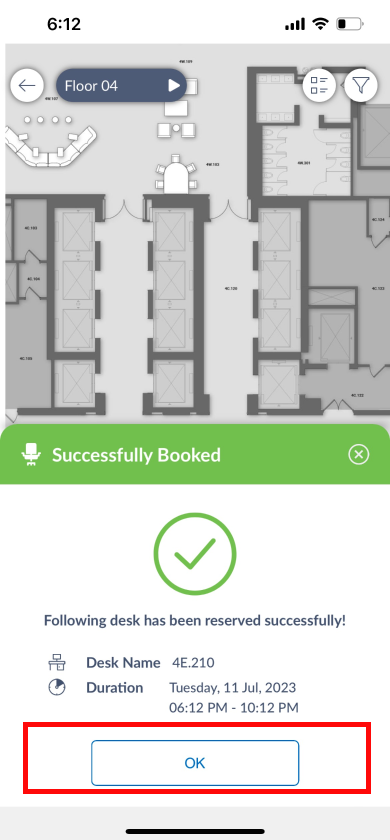
Non-ADA compliant design
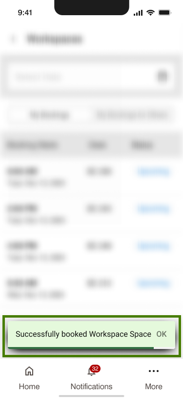
ADA compliant design
Navigation and Headers:
- Issue: Headers vary in style and descriptiveness across different screens.
- Recommendation: Standardize header styles and ensure they provide clear, descriptive information to aid navigation and context understanding.
Understandable
Consistent Layouts and Templates:
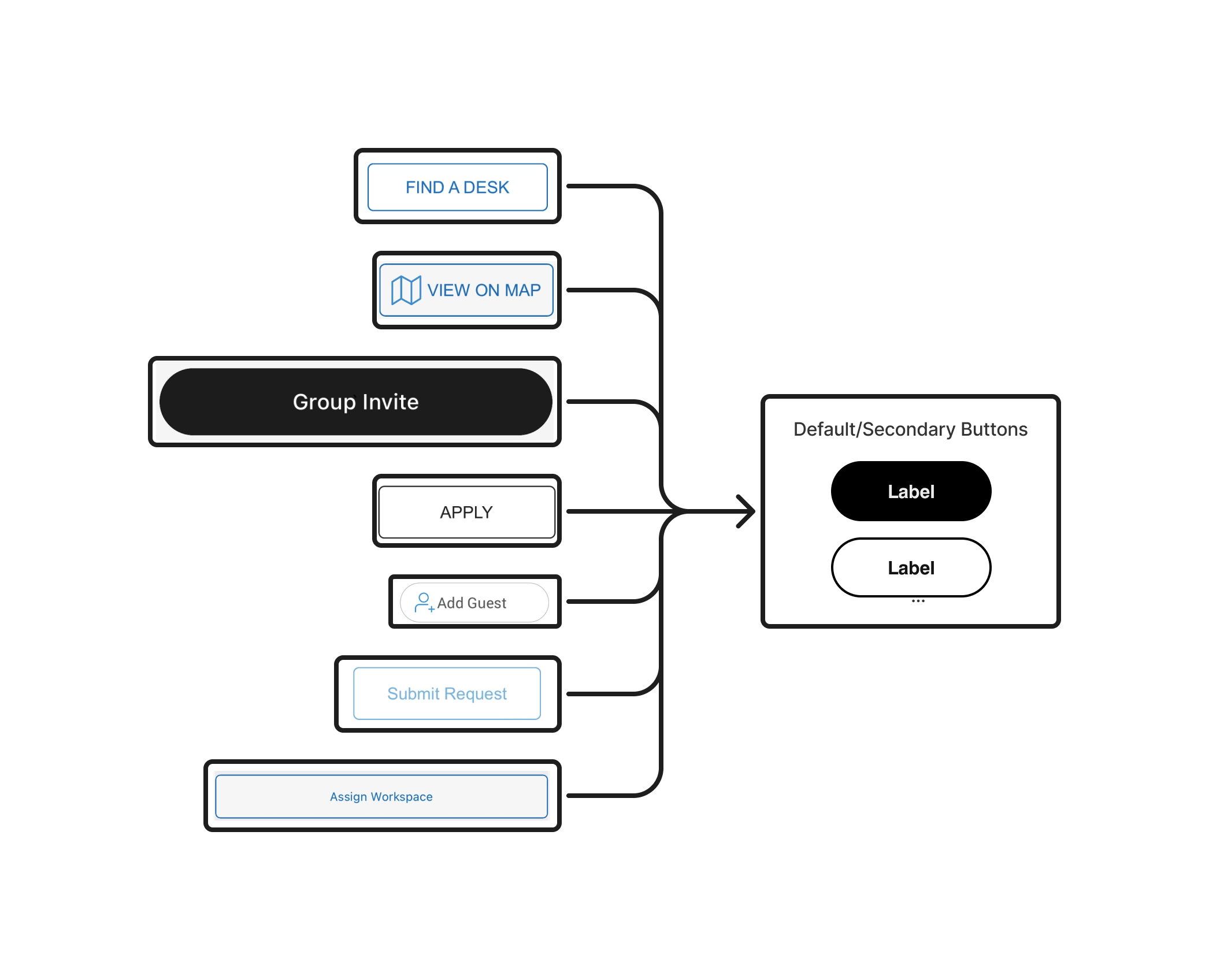
- Issue: The app uses varied UI elements inconsistently, including buttons, form inputs, icons, and calendar interfaces. For example, to indicate a date, there were 3 different calendar icons present. There were at least 7 different button styles.
- Recommendation: Develop and adhere to a design system that standardizes UI elements, including button styles, iconography, fonts, colors, form inputs, dropdown styles, lists, and other design elements. This consistency will enhance user familiarity and reduce cognitive load.

4 calendar icons to represent date.

One calendar icon that is part of the Marriott Design System
4 calendar icons to represent date.
One calendar icon that is part of the Marriott Design System
6 different button designs. None have adequate height for tapping and interaction on mobile
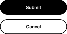
Primary and secondary buttons. Always stacked so user can interact with buttons on mobile and access them with either hand.
Avoiding Mistakes and Errors:
- Issue: Forms can be submitted with incomplete required fields, and there are no progress indicators for multi-step tasks.
- Recommendation: Disable the submit button until all required fields are completed and add progress indicators for multi-step tasks. This will help users avoid errors and track their progress.
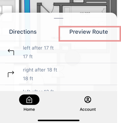
It is not clear that "Preview Route" is interactive as it looks just like "Directions"
It is not clear that "Preview Route" is interactive as it looks just like "Directions"
Clear Interactive Elements:
- Issue: Some interactive elements, such as the "Preview Route" button, do not visually indicate interactivity.
- Recommendation: Use distinct visual styles for interactive elements, such as buttons or underlined text, to ensure they are easily recognizable as clickable.
Robust
Easy Data Entry:
- Issue: Forms with numerous dropdowns and fields require excessive scrolling and interaction.
- Recommendation: Simplify data entry by using toggles, dropdowns with autocomplete, and consistent field designs. This will make forms easier to complete and navigate. This will also be resolved by creating a design system
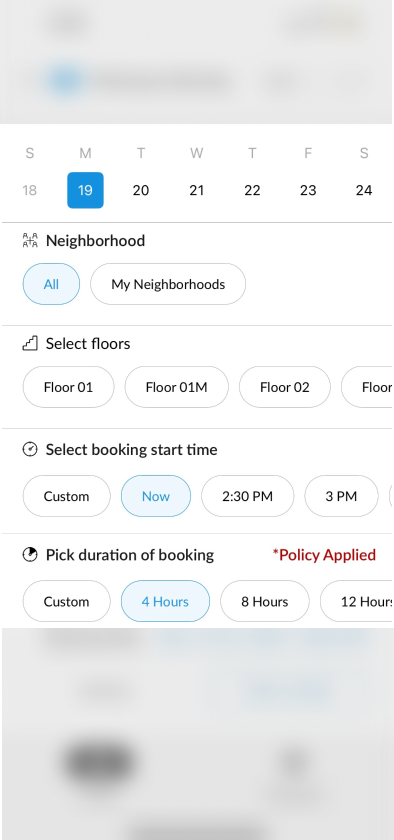
Form options can be improved here. For example, the booking time should be selected using a time picker instead of scrolling to select a time. Additionally, to select a floor, using a dropdown menu with a search function is more common and user-friendly, especially for a long list.
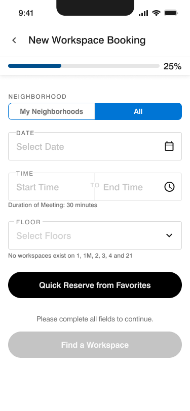
The new form has a tab toggle for selecting, a clear date picker and time picker and the floor list is now a dropdown
Simple Device Gestures and Navigation:
- Issue: Some features require complex gestures or horizontal scrolling, which can be challenging for users with motor impairments.
- Recommendation: Use simpler navigation methods, such as dropdown menus or text inputs, and avoid horizontal scrolling where possible.
Keyboard Navigation:
- Issue: Moving between text fields requires users to shift their hands away from the keyboard.
- Recommendation: Implement arrow keys for easier navigation between fields and ensure that input fields are easily accessible without significant hand movement.
Conclusion
Marriott International’s Property Management App for headquarters plays a vital role in managing operations efficiently. Ensuring its accessibility is essential not only for compliance with ADA standards but also for providing an inclusive user experience. By addressing the identified issues and implementing the recommended changes, Marriott can enhance the app’s usability and accessibility, making it a more effective tool for all users. These improvements will support Marriott’s commitment to excellence in operational efficiency and inclusivity.
Resources
- A Detailed Guide to WCAG Compliance in 2024
- Mobile Accessibility Examples from UAAG 2.0 Reference
- Mobile Accessibility: How WCAG 2.0 and Other W3C/WAI Guidelines Apply to Mobile
- Mobile Accessibility: Understanding Today's Standards and Best Practices
- The Responsive Website Font Size Guidelines
- WCAG 2.0 Techniques that Apply to Mobile